以下步骤将引导您创建基本的图表。例如,线条,饼状图,x-y 绘制,烛台图表。
| 示例程序使用了 C1Chart 控件。 |
Box | 演示了一个盒须(用来表示一组数据,并且让你很容易看到那些数字出现的最多)图表,该示例使用 C1Chart 控件。 |
Bubbles | 演示了一个数据流图表,该示例使用 C1Chart 控件。 |
Chlabels | 演示了一个带有鼠标跟着的水平条形图表,该示例使用 C1Chart 控件。 |
DataStyle | 演示了多种允许交互式样式变化的 2D图表。示例使用C1Chart 控件。 |
FloatBar | 演示了一个浮动的条形图表,示例使用 C1Chart 控件。 |
HLCandle | 演示了不同种类的价格/股票图表。示例使用 C1Chart 控件。 |
MemStatus | 示例使用 C1Chart 控件。 |
Pie | 演示了一个使用标签和效果的饼图。示例使用 C1Chart 控件。 |
Radar | 演示了一个雷达图并展示了如何迭代和填充雷达数据。示例使用 |
Scatter | 演示了一个散点图表,并用一个游戏展示了鼠标跟踪。示例使用 |
本章节含有以下指南:
指南 | 描述 |
Bar Chart Tutorial(268 页) | 本指南演示了如何在运行时或者代码来创建一个简单的条形图。 |
Line Chart Tutorial (273 页) | 本指南演示了如何在运行时或者通过代码来创建一个线形图。 |
Pie Chart Tutorial(278 页) | 本指南演示了如何在运行时或者通过代码来创建一个饼状图。 |
Candle Chart Tutorial (281 页) | 本指南演示了如何在运行时或者通过代码来创建一个烛台图。 |
条形图指南
本节将教您如何一步步地创建一个简单的条形图。该图形作为一个简单的条形图表用来显示信息,其中,y-轴表示每个产品价格的数值点,x-轴提供点之间的间距信息并为每一个数据点提供附属的标签信息。
在您创建该图表以前给您展示一下该图表大致的样子。
在设计时创建一个条形图 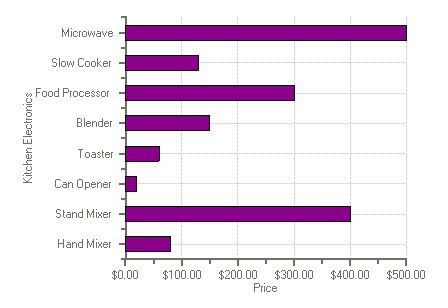
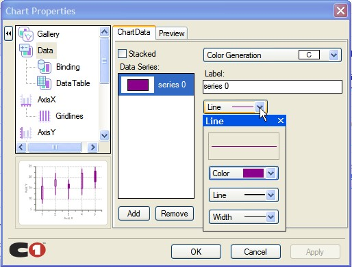
本主题引导您使用图表属性编辑器来创建一个简单的条形图。在本主题中您将学习到如何设置特殊的图表类型,为图表添加数据,给轴线做注解,所有的这些都是通过几个简单的步骤在设计时完成的。
这些任务都假定您已经将 C1Chart 控件添加到窗体中。
设置图表类型
使用一个智能标签向导来配置一个图表的第一个步骤是从可用图表类型中选择一个库类型。从像条形图和线性图一样的简单图表到像极地和表面一样的更加复杂的图表,C1Chart 允许您进行任何的数据可视化处理。
- 在 C1Chart 控件上右键点击,然后在快捷菜单中点击 Chart Properties。
- 在树视图面板上选择 Gallery。然后从 Simple Types 列表中选择 Bar。
- 在面板上,选择左上的条目,然后点击 Apply 按钮。
 修改数据序列
- 从树视图面试中选择 Data。
- 通过点击 Remove 来删除 Series0, Series 1, Series 2, 和 Series 3。
- 通过点击 Add 来添加一个新的用于显示商品价格的 Y-值的序列。 会出现一个提示信息来提醒您必须给新序列添加数据。
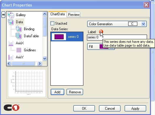
给数据序列添加数据
- 从树视图面板中选择 Data->DataTable。然后向数据表中添加以下的数据。
- 在X-表上单击,并输入以下的 X-Y数值对: (0,80),(1,400), (2,20), (3,60), (4,150), (5,300), (6,130), 和(7,500)。 注意:通过点击 Tab 来将光标移动到下一个 X-Y 值中。
- 点击 Apply 来更新图表。 一个更新后的图表的预览图像会出现在图表属性编辑器的左下方区域中。
配置轴线
下面我们给 x-轴线和 y-轴线做注解。我们将使用值标签来给 x-轴线做注解。
- 从树视图面板中选择 AxisX,接着选择注解选项卡。
- 从方法下拉列表框中选择 ValueLabels。
一个 Labels 按钮将会出现。
- 点击 Labels 来打开 ValueLabel Collection Editor。
- 点击 Add 按钮八次来添加八个值标签。
- 在 Members 列表框中选择第一个值标签。并设置 NumericValue 属性为 0,并且设置它的 Text 属性为"Hand Mixer"
- 设置标签的剩余属性为以下的值:
- ValueLabel1 的 NumericValue 属性设置为 1 并将 Text 属性设置为"Stand
Mixer"。
- ValueLabel2 的 NumericValue 属性设置为 2 并将 Text 属性设置为"Can
Opener"。
- ValueLabel3的NumericValue属性设置为3并将Text属性设置为"Toaster"。
- ValueLabel4的NumericValue属性设置为4并将Text属性设置为"Blender"。
- ValueLabel5 的 NumericValue 属性设置为 5 并将 Text 属性设置为"Food
Processor"。
- ValueLabel6 的 NumericValue 属性设置为 6 并将 Text 属性设置为"Slow
Cooker"。
- ValueLabel7 的 NumericValue 属性设置为 7 并将 Text 属性设置为
"Microwave"。
- 点击 OK 按钮来将值标签应用到 x-轴线注解上。
- 从树视图面板上选择 AxisY,然后选择注解选项卡。
- 从格式化下拉列表中选择 NumericCurrency。
给轴线设置标题
- 设置 AxisX 标题,从树视图面板中选择 AxisX。并将其 Title 设置为"Kitchen
Electronics"
- 设置 AxisY 标题,从树视图面板中选择 AxisY。并将其 Title 设置为"Price"
- 点击 OK 来关闭图表属性编辑器。
以编程方式创建一个条形图 一个简单的条形图可以按照以下步骤来以编程方式来创建:
- 给窗体添加一个 C1Chart 控件。
- 在窗体上右键点击,并选择查看代码来查看代码文件。然后添加以下的代码来声明
C1.Win.C1Chart 命名空间。
- Visual Basic
Imports C1.Win.C1Chart;
- C# using C1.Win.C1Chart;
3. 3,双击窗体并在 Form1_Load 事件处理函数中添加以下的逻辑来生成一个简单的条形图。
- Visual Basic
Private Sub Form1_Load(ByVal sender As System.Object, ByVal e As System.EventArgs) Handles MyBase.Load |
C#
private void Form1_Load(object sender, EventArgs e)
{
// Clear previous data c1Chart1.ChartGroups[0].ChartData.SeriesList.Clear();
// Add Data string[] ProductNames = { "Hand Mixer", "Stand Mixer", "Can Opener",
"Toaster" ,"Blender" ,"Food Processor" ,"Slow Cooker" ,"Microwave"}; int[] PriceX = { 80, 400, 20, 60, 150, 300, 130, 500 };
// create single series for product price
C1.Win.C1Chart.ChartDataSeries ds1 = c1Chart1.ChartGroups[0].ChartData.SeriesList.AddNewSeries(); ds1.Label = "Price X";
//Use the CopyDataIn method of the ChartDataArray object to copy the X and Y value data into the data series ds1.X.CopyDataIn(ProductNames); ds1.Y.CopyDataIn(PriceX);
// Set chart type c1Chart1.ChartArea.Inverted = true; c1Chart1.ChartGroups[0].ChartType = C1.Win.C1Chart.Chart2DTypeEnum.Bar;
// Set axes titles c1Chart1.ChartArea.AxisX.Text = "Kitchen Electronics"; c1Chart1.ChartArea.AxisY.Text = "Price"; //Set format for the Y-axis annotation c1Chart1.ChartArea.AxisY.AnnoFormat = FormatEnum.NumericCurrency;
}线性图表指南
本章节介绍了如何创建带有符号的线性图表,它是默认的图表类型。一个线性图表是另外一种简单的用于展示数据关系的方式。
在这个示例里我们会创建一个带有符号的线性图表。我们只使用一个数据序列,因为只有一条线。这个线将用来表示一定时间范围内一个公司的利润的增长。在这个例子中的水平轴线,x 轴,代表年份值。例子中的垂直轴线,y 轴,代表以千美元为单位的利润值。
当你完成以下的步骤后,你将会创建如下图的出来。
 在设计时创建带有符号的线性图表。
本任务假设您已经在您的窗体上添加了一个 C1Chart 控件。
设置图表类型
使用一个图表属性设计器来配置一个图表的第一个步骤是从可用图表类型中选择一个库类型。
- 在 C1Chart 控件上右键点击,然后在快捷菜单中点击 Chart Properties。
- 在树视图面板上选择 Gallery。然后从 Simple Types 列表中选择 Line。
- 在紧挨着主要图表类型的面板上,选择 X-Y chart, lines, symbols subtype,然后点击 Apply 按钮。
默认的线性图表将会添加两个数据序列,并创建条线。
修改数据序列 4. 从树视图面试中选择*Data*。 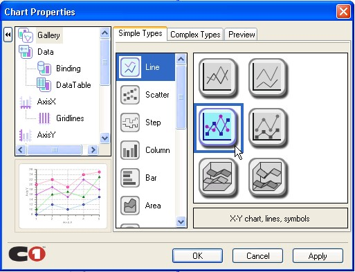
- 通过点击 Remove 来删除 Series0, Series 1, Series 2, 和 Series 3。
给数据序列添加数据
- 从树视图面板中选择 Data->DataTable。,在 XY 数据表上单击,并输入以下的
X-Y 数值对:
(2004,50), (2005,100), (2006, 150), (2007, 100)。
注意:通过点击 Tab 来将光标移动到下一个 X-Y 值中。
- 从默认的线性图表中删除最后一个 XY 值。
- 点击 Apply 来更新图表。
一个更新后的图表的预览图像会出现在图表属性编辑器的左下方区域中。
修改轴线外观
下面我们修改 X 轴 Y 轴的默认标题,并且我们将使用图表属性编辑器来改变轴线的字体样式。从树视图面板中选择 AxisX,接着选择注解选项卡
- 从树视图面板中选择 AxisX。
- 在 AxisX 选项卡中,在标题中输入"Year"。然后点击 Font 按钮,然后出现字体对话框。
- 将字体样式设置为粗体并将字体大小设置为 10。然后点击 OK 按钮。
- 在图表属性编辑器中,点击 Apply 按钮。对 X-轴线的修改就会反映在图表中。
- 从树视图中选择 AxisY。
- 在 AxisY 选项卡中,在标题中输入" Profit (thousands of dollars) "。然后点击
Font 按钮,然后出现字体对话框。
- 将字体样式设置为粗体并将字体大小设置为 10。然后点击 OK 按钮。
- 在图表属性编辑器中,点击 Apply 按钮。对 Y-轴线的修改就会反映在图表中。
- 点击 OK 来关闭图表属性编辑器。
有成就感吧!您已经完成了使用图表属性编辑器创建一个线性图表的全过程。
以编程方式创建一个线性图表
一个简单的线性图可以按照以下步骤来以编程方式来创建:
- 给窗体添加一个 C1Chart 控件。
- 在窗体上右键点击,并选择查看代码来查看代码文件。然后添加以下的代码来声
明 C1.Win.C1Chart 命名空间。
- Visual Basic
Imports C1.Win.C1Chart;
- C#
using C1.Win.C1Chart;
3. 双击窗体并在 Form1_Load 事件处理函数中添加以下的逻辑来生成一个简单的
条形图。
- Visual Basic
Private Sub Form1_Load(ByVal sender As System.Object, ByVal e As System.EventArgs) Handles MyBase.Load |
C#
private void Form1_Load(object sender, EventArgs e)
{
//create data for the chart double[] xdata = { 2004, 2005, 2006, 2007 }; double[] ydata = { 50, 100, 150, 200 };
//clear previous series c1Chart1.ChartGroups[0].ChartData.SeriesList.Clear();
//add one series to the chart
C1.Win.C1Chart.ChartDataSeries ds = c1Chart1.ChartGroups[0].ChartData.SeriesList.AddNewSeries();
//copy the x and y data ds.X.CopyDataIn(xdata); ds.Y.CopyDataIn(ydata); //set the chart type c1Chart1.ChartGroups[0].ChartType = C1.Win.C1Chart.Chart2DTypeEnum.XYPlot;
//create new font for the X and Y axes
Font f = new Font("Arial", 10, FontStyle.Bold); c1Chart1.ChartArea.Style.ForeColor = Color.DarkGray; c1Chart1.ChartArea.AxisX.Font = f; c1Chart1.ChartArea.AxisX.Text = "Year"; c1Chart1.ChartArea.AxisX.GridMajor.Visible = true; c1Chart1.ChartArea.AxisX.GridMajor.Color = Color.LightGray; c1Chart1.ChartArea.AxisY.Font = f; c1Chart1.ChartArea.AxisY.Text = "Profit (thousands of dollars)"; c1Chart1.ChartArea.AxisY.GridMajor.Visible = true; c1Chart1.ChartArea.AxisY.GridMajor.Color = Color.LightGray;
//modify line style appearance ds.LineStyle.Color = Color.LightPink; ds.LineStyle.Pattern = LinePatternEnum.Solid; ds.LineStyle.Thickness = 1;
//modify the symbol style appearance ds.SymbolStyle.Shape = SymbolShapeEnum.Box; ds.SymbolStyle.Color = Color.LightPink; ds.SymbolStyle.OutlineColor = Color.Black; ds.SymbolStyle.Size = 5; ds.SymbolStyle.OutlineWidth = 1; c1Chart1.ChartArea.PlotArea.BackColor = Color.White;
}饼状图表指南
本节将教您如何一步步地创建一个饼状图表。饼状图表用来表示简单值。不同于其他的
C1Chart 图表类型,饼状图表必须含有多于一个的序列以显示多个切片。如果仅有一个序列,那么饼状图表将会显示一个圆环而不会显示任何的切片。在本实例中,我们会创建有八个切片的饼状图表,所以我们会有八个序列,每个点对应一个序列,最终会有八个点。
下图展示了一个使用一个切片来代表一个商品种类的饼状图表。

以下将说明使用图表对象来在运行时和以编程方式来创建一个饼状图表的步骤。
在设计时创建一个饼状图表。
本任务假设您已经在您的窗体上添加了一个 C1Chart 控件。
设置图表类型
使用一个图表属性设计器来配置一个图表的第一个步骤是从可用图表类型中选择一个库类型。
- 在 C1Chart 控件上右键点击,然后在快捷菜单中点击 Chart Properties。
- 在树视图面板上选择 Gallery。然后从 Simple Types 列表中选择 Pie。
- 在面板上,选择左上的饼状图,然后点击 Apply 按钮。
默认的饼状图表将添加五个饼状图并且每一个带有四个数据序列。
修改数据序列
- 从树视图面试中选择 Data。
- 通过点击 Remove 来删除 Series0, Series 1, Series 2, 和 Series 3。
- 点击 Add 来为 y-值新增一个序列,它用来表示商品的价格。
会有一个警告信息来提醒您必须给新增的序列添加数据。
- 点击 Add 按钮七次来添加剩余的七个数据序列到饼形图表中。这样,该饼形图表将含有八个切片。
- 从树视图面板中选择 Data->DataTable。
- 在数据表上点击第一个字段,并输入以下的(X,Y)数值对: (1,80), (1,400), (1,20),
(1,60), (1,150), (1,300), (1,130), 和 (1,500)。
- 从树视图面板中选择数据项目,然后在数据序列下拉框中选择数据序列。然后给每一个数据序列的 Label 文本框中输入以下的内容:
- 设置 Series0 为"Hand Mixer ($80.00)"
- 设置 Series1 为"Stand Mixer ($400.00)"
- 设置 Series2 为"Can Opener ($20.00)"
- 设置 Series3 为"Toaster ($60.00)"
- 设置 Series4 为"Blender ($150.00)"
- 设置 ries5 为 Food Processor ($300.00)"
- 设置 ries6 为 Slow Cooker ($130.00)"
- 设置 ries7 为 crowave ($500.00)"
给饼形图表添加图例为了启用图例。在图表属性编辑器的树视图面板选择 Appearance,然后选择 Legend 复选
框。
以编程方式来创建一个饼状图表 本任务假设您已经在您的窗体上添加了一个 C1Chart 控件。
按照以下的步骤可以以编程方式创建一个饼状图表:
1. 添加以下的代码来引入 C1.Win.C1Chart 命名空间。
- Visual Basic
Imports C1.Win.C1Chart;
- C# using C1.Win.C1Chart;
2. 双击窗体并在 Form1_Load 事件处理函数中添加以下的逻辑来生成一个简单的饼形图:
Visual Basic
Private Sub Form1_Load(ByVal sender As System.Object, ByVal e As System.EventArgs) Handles MyBase.Load
' Set chart type
C1Chart1.ChartArea.Inverted = True
C1Chart1.ChartGroups(0).ChartType = C1.Win.C1Chart.Chart2DTypeEnum.Pie ' Clear previous data
C1Chart1.ChartGroups(0).ChartData.SeriesList.Clear()
' Add Data
Dim ProductNames As String() = {"Hand Mixer", "Stand Mixer", "Can Opener", "Toaster", "Blender", "Food Processor", "Slow Cooker", "Microwave"}
Dim PriceX As Integer() = {80, 400, 20, 60, 150, 300,
130, 500}
'get series collection
Dim dscoll As ChartDataSeriesCollection = C1Chart1.ChartGroups(0).ChartData.SeriesList
For i As Integer = 0 To PriceX.Length - 1
'populate the series
Dim series As ChartDataSeries = dscoll.AddNewSeries()
'Add one point to show one pie series.PointData.Length = 1
'Assign the prices to the Y Data series series.Y(0) = PriceX")
'format the product name and product price on the legend series.Label = String.Format("{0} ({1:c})", ProductNames, PriceX) Next
' show pie Legend
C1Chart1.Legend.Visible = True
'add a title to the chart legend
C1Chart1.Legend.Text = "Product Unit Prices"
End Sub- C#
private void Form1_Load(object sender, EventArgs e) // Set chart type c1Chart1.ChartArea.Inverted = true; c1Chart1.ChartGroups[0].ChartType = C1.Win.C1Chart.Chart2DTypeEnum.Pie; // Clear previous data c1Chart1.ChartGroups[0].ChartData.SeriesList.Clear(); // Add Data string[] ProductNames = { "Hand Mixer", "Stand Mixer", "Can Opener", "Toaster" ,"Blender" ,"Food Processor" ,"Slow Cooker" ,"Microwave"}; int[] PriceX = { 80, 400, 20, 60, 150, 300, 130, 500 }; ChartDataSeriesCollection dscoll = c1Chart1.ChartGroups[0].ChartData.SeriesList; //Assign the prices to the Y Data series series.Y[0] = PriceX[i]; //format the product name and product price on the legend series.Label = string.Format("{0} ({1:c})", ProductNames[i], PriceX[i]); } |
烛台图指南
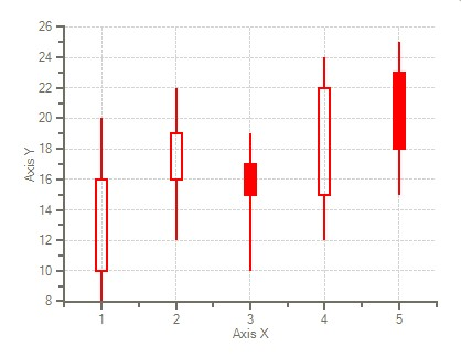
本节将教您如何一步步地创建一个烛台图表。图表使用烛台来表示信息,其中,y-轴线上的
Y 值代表股票的高,低,开,闭值。X-轴的值为每一个蜡烛提供位置。
在您创建图表之前下图显示了其大致的效果:
以下将说明使用图表对象来在运行时和以编程方式来创建一个烛台图的步骤。
在设计时创建一个烛台图
本主题将引导您使用图表属性编辑器来一步步地创建一个烛台图。在本主题中,您将学习到如何在设计时使用几个简单步骤来进行设置图表类型,修改数据序列,给图表添加数据,格式化外观等操作。
本任务假设您已经在您的窗体上添加了一个 C1Chart 控件。
设置图表类型
使用一个图表属性设计器来配置一个图表的第一个步骤是从可用图表类型中选择一个库类型。从像条形图和线性图一样的简单图表到像极地和表面一样的更加复杂的图表,C1Chart 允许您进行任何的数据可视化处理。
- 在 C1Chart 控件上右键点击,然后在快捷菜单中点击 Chart Properties。
- 在树视图面板上选择 Gallery。然后从 Simple Types 列表中选择 Stock。
- 在面板上,选择左上的饼状图,然后点击 Apply 按钮。
 修改数据序列
- 从树视图面试中选择 Data。
- 通过点击 Remove 来删除 Series0, Series 1, Series 2, 和 Series 3。
- 点击 Add 来为 y-值新增一个序列,它用来表示每一个股票的值。
会有一个警告信息来提醒您必须给新增的序列添加数据。
添加数据到数据序列中
- 从树视图面板中选择 Data->DataTable。在数据表中添加以下的数据。
- 像下述表格一样添加数据值。
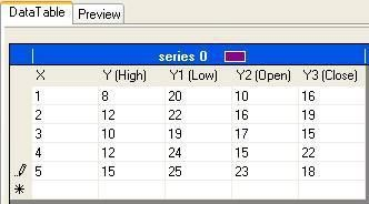
注意:X 代表在 x-轴上的位置。Y 代表高值,Y1 代表低值,Y2 代表开值,Y3 代表闭值。
- 点击 Apply 按钮来更新图表。
一个更新后的图表的预览图像会出现在图表属性编辑器的左下方区域中。
格式化烛台图
接下来我们将把线的颜色变为红色。增加蜡烛的柱体宽度,增加线的厚度。其中,我们使用
LineStyle 属性来把线的颜色变为红色,使用 SymbolStyle 属性来增加蜡烛的柱体宽度,使用 LineStyle 属性来增加线的厚度。
- 在树视图面板中选择 Data 节点,然后选择 ChartData 选项卡。
- 点击 Line 后面紧挨着的下拉箭头。
- 在下拉列表中中选择 Color,并选择其中的红色。
- 点击紧挨着 Width 的下拉箭头,并选择第二种线。
- 点击 OK 来保存修改并关闭图表属性对话框。
- 打开 C1Chart 属性窗口,并点击 SeriesList 后面的省略号按钮(…)。然后 ChartDataSeries Collection Editor 会出现。
- 然后展开 SymbolSize 节点,并设置 SymbolStyle。Size 属性为 10。
- 蜡烛的柱体大小会从默认的 5 变成 10。
以编程方式来创建一个烛台图 一个烛台图可以按照以下的步骤以编程方式创建。
1. 添加以下的代码来引入 C1.Win.C1Chart 命名空间。
- Visual Basic
Imports C1.Win.C1Chart;
- C# using C1.Win.C1Chart;
2. 双击窗体并在 Form1_Load 事件处理函数中添加以下的逻辑来生成一个简单的饼形图:
- Visual Basic
Private Sub Form1_Load(ByVal sender As Object, ByVal e As EventArgs) c1Chart1.ChartGroups(0).ChartData.SeriesList.AddNewSeries() |
C#
private void Form1_Load(object sender, EventArgs e)
{
c1Chart1.ChartGroups[0].ChartData.SeriesList.AddNewSeries();
//Declare the x and y variables as double to represent the x, y, y1, y2, and y3 values and assign the values double[] x = new double[] { 1, 2, 3, 4, 5 }; double[] y_hi = new double[] { 8, 12, 10, 12, 15 }; double[] y_low = new double[] { 20, 22, 19, 24, 25 }; double[] y_open = new double[] { 10, 16, 17, 15, 23 }; double[] y_close = new double[] { 16, 19, 15, 22, 18 }; //copy the x, y, y1, y2, and y3 data into the chart group c1Chart1.ChartGroups[0].ChartData[0].X.CopyDataIn
 ; c1Chart1.ChartGroups[0].ChartData[0].Y.CopyDataIn(y_hi); c1Chart1.ChartGroups[0].ChartData[0].Y1.CopyDataIn(y_low); c1Chart1.ChartGroups[0].ChartData[0].Y2.CopyDataIn(y_open); c1Chart1.ChartGroups[0].ChartData[0].Y3.CopyDataIn(y_close);
//assign the candle chart to the chart type c1Chart1.ChartGroups[0].ChartType = C1.Win.C1Chart.Chart2DTypeEnum.Candle;
//Make the rising candles transparent to show rising prices c1Chart1.ChartGroups[0].HiLoData.FillTransparent = true;
//Declare the color for the lines
c1Chart1.ChartGroups[0].ChartData.SeriesList[0].LineStyle.Color = System.Drawing.Color.Red; //Increase the line thickness c1Chart1.ChartGroups[0].ChartData.SeriesList[0].LineStyle.Thickness = 2; c1Chart1.ChartGroups[0].ChartData.SeriesList[0].SymbolStyle.Size = 10;
}多图表指南
本主题将引导您以编程方式来一步步地在一个图表上添加一个 Bar 和 XYPlot 图表。图表使用条状图的 y-轴来表示平均的降雨量,X-轴线代表从五月到八月的月份字符串值。XYPlot 图表使用一个 y2-轴线来代表从五月到八月的每月的平均气温值,X-轴线代表从五月到八月的月份字符串值。
在您创建该图表之前下图用来展示该图表的效果。
1. 添加以下的代码来引入 C1.Win.C1Chart 命名空间。- Visual Basic
Imports C1.Win.C1Chart;
- C#
using C1.Win.C1Chart;
2. 双击窗体并在 Form1_Load 事件处理函数中添加以下的逻辑来生成一个简单的饼形图:
多图表可以按照以下的步骤以编程方式创建。 !worddav22cd1ff53d91e295f98b0b79245eaddb.png|height=341,width=471!Visual Basic
Private Sub Form1_Load(sender As Object, e As EventArgs) Dim cgroup As ChartGroup = c1Chart1.ChartGroups.Group0 cgroup.ChartType = Chart2DTypeEnum.Bar
'input the data through the series collection
Dim cdsc As ChartDataSeriesCollection = cgroup.ChartData.SeriesList cdsc.Clear()
'remove default data
'create the series object from the collection and add data
Dim cds As ChartDataSeries = cdsc.AddNewSeries()' Add Data for ChartGroup0, Bar chart
Dim MonthNames As String() = {"March", "April", "May", "June", "July", "August"}
Dim AvgPrecip As Double() = {3.17, 3.01, 3.8, 4.12, 3.96, 3.38}
'create a label for the Bar chart data series cds.Label = "Avg. Precip"
'Use the CopyDataIn method of the ChartDataArray object to copy the X and Y value data into the data series cds.X.CopyDataIn(MonthNames) cds.Y.CopyDataIn(AvgPrecip)
'create variable for chart area
Dim carea As C1.Win.C1Chart.Area = c1Chart1.ChartArea
'Set axes titles for the ChartGroup0 (Bar) carea.AxisX.Text = "Month" carea.AxisY.Text = "Avg. Precip (in)"
'create and add the data for the XY chart in Group1
Dim cgroup2 As ChartGroup = c1Chart1.ChartGroups.Group1 cgroup2.ChartType = Chart2DTypeEnum.XYPlot
'input the bar chart data of group1 through the series collection
Dim cdsc2 As ChartDataSeriesCollection = cgroup2.ChartData.SeriesList
'create the series object from the second collection and add data
Dim cds2 As ChartDataSeries = cdsc2.AddNewSeries() cds2.X.CopyDataIn(MonthNames) cds2.Y.CopyDataIn(New Double() {49.5, 60.7, 70.8, 79.1, 82.7, 81.1}) cds2.Label = "Avg. High Temp"
'customize axes
'create new font for the X, Y and Y2 axes Dim f As New Font("Arial", 10) carea.AxisX.Font = f carea.AxisY.Font = f
Dim cdsc As ChartDataSeriesCollection = cgroup.ChartData.SeriesListcarea.AxisX.ForeColor = Color.SteelBlue carea.AxisY.ForeColor = Color.SteelBlue carea.AxisY2.ForeColor = Color.SteelBlue carea.AxisY2.Font = f
'Set axes titles for the ChartGroup1 (XYPlot) carea.AxisY2.Text = "Avg. High Temp (F)"
'set axis bounds carea.AxisY.Min = 2.75 carea.AxisY2.Min = 30 carea.AxisY2.Max = 90 carea.AxisY.UnitMinor = 0.25
'rotate the axis X annotation carea.AxisX.AnnotationRotation = 60
'add legend c1Chart1.Legend.Visible = True
'add header c1Chart1.Header.Visible = True c1Chart1.Header.Text = "Pittsburgh Spring and Summer Season"
'add visual effects
Dim s As Style = carea.Style s.ForeColor = Color.White
s.BackColor = Color.LightBlue
s.BackColor2 = Color.Azure
s.GradientStyle = GradientStyleEnum.Radial c1Chart1.ColorGeneration = ColorGeneration.Flow- C#
private void Form1_Load(object sender, EventArgs e)
{
ChartGroup cgroup = c1Chart1.ChartGroups.Group0; cgroup.ChartType = Chart2DTypeEnum.Bar;
//input the data through the series collection // Add Data for ChartGroup0, Bar chart string[] MonthNames = { "March", "April", "May", "June", "July", "August" }; double[] AvgPrecip = { 3.17, 3.01, 3.80, 4.12, 3.96, 3.38};
cds2.Y.CopyDataIn(new double[] { 49.5, 60.7, 70.8, 79.1, 82.7, 81.1}); cds2.Label = "Avg. High Temp"; |
//customize axes |